
HR teams can collect survey responses quickly, but turning those responses into real action takes more discipline. According to Gallup, only 8% of employees strongly agree that their organization actually takes action on survey feedback. For frontline workers on warehouse floors and overnight shifts, that disconnect hits hardest: most survey tools assume computer access and corporate email that these employees simply don't have, which means data goes unanalyzed, turnover risks go unnoticed, and the moment to act passes before a report even lands on anyone's desk.
TL;DR
- Define the business decision you want to make before writing a single survey question.
- Organize data by location, shift, department, and tenure before drawing any conclusions.
- Pair scores with open-text comments so decision-makers understand the "why" behind the numbers.
- Run reports and download results in formats your stakeholders can use without help: CSV for analysts, PDF for site managers and a dashboard for executives.
- Every key finding should connect to a named owner, a specific action, and a measurable goal.
- SMS-based platforms like Yourco reach every frontline worker directly and make it easy to run segmented reports, download results, and close the feedback loop across all sites and shifts.
1. Start With the Outcome You Want to Influence
Clear survey analysis for frontline workers starts before the survey launches, with the specific decision you need to make. When you define that outcome first, your questions guide real action and keep the dashboard focused. Employee surveys tied to defined business outcomes, such as reducing turnover or improving shift coverage, yield actionable insights.
For a survey design that captures the right data for frontline teams, use this guide on how to create an employee engagement survey.
Start by writing a short problem statement: "We need to reduce voluntary quits in the first 90 days among warehouse associates." Then list the decisions the data should inform. You might update onboarding steps or coach supervisors on recognition. Every question you add should point back to these choices. Cut any item that doesn't connect to a specific decision. This focus prevents the "interesting but not actionable" data overload that buries HR teams with frontline responsibilities.
For frontline workers, link each question to a change employees will actually notice on the floor. Ask about locker room cleanliness only if you can schedule extra cleanings. If you probe for PPE availability, plan to restock quickly if scores dip. Organizations that complete the full feedback-to-action cycle consistently achieve survey response rates in the mid-nineties. Employees build that trust when speaking up leads to something changing.
SHRM data shows 86% of frontline workers feel engaged in their roles, yet half feel their organization puts little effort into understanding and addressing their needs. A well-designed survey tied to visible follow-through gives workers a clearer way to tell leaders what needs attention.
A short problem statement should come before the first survey question. Items that do not connect to a specific decision only make the results harder to use.
2. Organize Data for Clarity, Not Complexity
Once you've collected responses from frontline workers, make the numbers easy to read quickly. Supervisors and operations leaders don't have time to dig through raw exports. Simple metrics like favorability scores, the percentage of employees who respond positively to a question, convert raw answers into a single number showing how many people feel good about a topic.
Use a simple sequence to organize frontline survey data:
- Clean the data first by removing duplicates, flagging suspicious responses, and deleting blank entries so errors don't muddy your results.
- Segment results by department, location, shift, or tenure. Company-wide averages can hide pockets of concern. A night-shift safety problem may disappear inside the average.
- Color-coded heat maps make problem areas visible immediately.
- Side-by-side bar charts show how current results compare to previous survey cycles.
- Site and schedule tags help site managers review their team's data during daily shift huddles.
Before building a single slide deck, export segmented data cuts in formats your stakeholders can open without help. Analysts can use CSV files, site managers can use PDF summaries, and executives may need a dashboard view. For organizations in regulated industries such as manufacturing or logistics, downloadable reports also support compliance documentation. OSHA training documentation requirements mandate that records include employee names, dates, training content, and means of verifying comprehension, with retention periods ranging from 3 years to the duration of employment. A timestamped report of who received which communication and when can turn survey and safety training data into audit-ready documentation. Build this into your standard process before a compliance review arrives.
This information is for general awareness only. For specific compliance guidance, consult with qualified legal professionals.
Checking for incomplete answers takes a few extra minutes but saves you from having to explain questionable findings later. Pay close attention to small sample sizes. When a single shift has only five respondents, individual responses can create misleading patterns. When you clean, segment, and export data consistently, you give floor supervisors, site leaders, and executives a clear path from feedback to meaningful action.
Standard export formats belong in your survey process from day one, segmented by site, shift, and department. Results should be ready to share as soon as the survey closes.
3. Focus on the "Why" Behind the Score
Frontline survey analysis goes wrong when HR stops at the number. A low score tells you what is happening. Comments, context, and segmentation tell you why, and that explanation leads to a real fix.
Pair each score with the comments that explain it. A low rating on career growth becomes actionable when you read, "I don't see a path beyond my current role," or "My supervisor never told me there were supervisor positions open." Look for platforms that show scores and employee comments side by side in one view.
When hundreds of comments come in from a large frontline workforce, text analysis tools can group similar feedback into themes in minutes. Words like "communication" and "staffing" surface consistently in frontline feedback. Pick one or two direct quotes that capture each theme and place them next to the relevant chart. Real employee language lands harder with decision-makers than a percentage point.
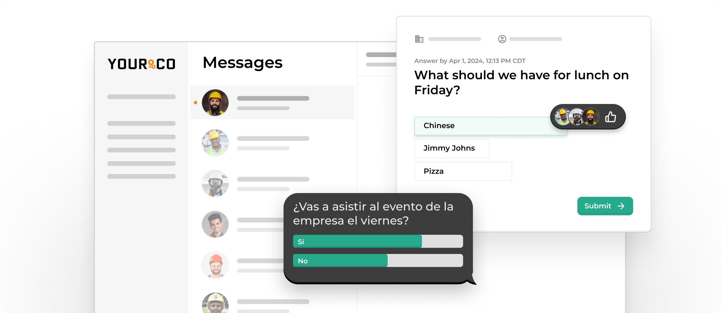
Segment results by location, shift, and tenure before choosing a fix for shift-based teams. A low safety rating might drag down your overall score, but tracing it back could reveal that one site is driving the problem because equipment checks are skipped during understaffed shifts. That calls for a different response than a company-wide safety campaign.
Open-ended survey questions consistently surface the most powerful and actionable insights, particularly for frontline workers, where corporate decision-making often feels distant and open-text responses are frequently the only place honest feedback appears.
A score should reach decision-makers with at least two supporting comments that explain the driver. Leaders may question numbers; employee voices make the issue harder to dismiss.
4. Turn Data Into Storylines Decision-Makers Care About
Survey data drives action when HR frames each finding around the decision leaders need to make. Every key finding should connect directly to a business outcome.
Start every report with a single sentence that tells leaders why they should care. "Turnover risk among first-year manufacturing associates doubled in Q3, driven by concerns about shift predictability and supervisor communication" immediately frames the stakes. From there, build a narrative around the decision leaders need to make.
Use this four-step structure for each key finding:
- State what the data shows.
- Show the score, trend, and segment.
- Describe what workers are experiencing.
- Assign one specific action.
For example: "Communication scores in the warehouse fell 18 points below last year, and 42 comments mention 'unclear shift handoffs.' Missed handoffs have already caused three unplanned overtime shifts this quarter. Recommendation: Launch daily stand-up huddles before each shift and assign the site supervisor to lead them." Link the finding to a cost, then to a fix. Leaders who scan the report can quickly see the path forward.
Perceptyx recommends presenting no more than two or three priority areas with the highest engagement impact, tied directly to business objectives. Everything else goes into an appendix or a dashboard that executives can pull when they want details. Busy leaders scan first. Use bold sub-heads and call-out boxes to spotlight problem areas. Simple visuals like heat maps can carry detail without overwhelming leaders with tables.
Adjust depth for each audience. Executives want the headline and the return on investment. Line managers need details specific to their own teams, in language they can use in a shift huddle the same day. Most evidence points to the manager level as the biggest opportunity to improve engagement, which means team-specific reports need to reach managers as soon as executives see the read-out.
For every major finding, use a Situation-Complication-Resolution structure. Show the data, explain the cost of inaction, and name the action that addresses it.
5. Highlight the Actions Leaders Will Take
Survey analysis that stops at "here's what we found" becomes survey theater: collecting feedback without visible follow-through that can destroy participation in your next round. For frontline workers who already feel their voices aren't heard, the absence of visible action confirms their skepticism.
Once you finish analyzing results, gather managers and employees to decide which problems to tackle first. Rank each issue using two measures: how much it affects your business and how realistically your team can fix it within a defined timeline.
Perceptyx data quantifies the difference action planning makes: organizations that equip managers to create and track action plans see engagement gains in 59% of cases, more than double the 28% rate seen in organizations without structured follow-through. When employees see visible behavior change in response to their feedback, 69% of organizations see increased engagement in the next cycle.
Every action needs clear ownership and measurable outcomes:
- One person owns each action item. Avoid assigning accountability to an entire team.
- The responsible manager commits to a public deadline.
- Success has a specific target tied to a measurable goal.
- Your next pulse check or survey cycle tracks progress.
- Frontline workers should see results on break-room boards, in shift huddles, or through a direct SMS update from their supervisor.
For safety concerns, fast visible action matters beyond engagement. If frontline workers flag a hazard and nothing changes within two weeks, workers ignore the next safety survey, and teams stop reporting real risks.
Publicly committing to at least one action per survey cycle before HR shares the results signals that this round is different from the last one. Name the change and the owner in the same message as the survey results.
6. Simplify Sharing and Follow-Up Across Locations
Frontline survey analysis needs the right distribution plan as much as the right data. Most internal communication still assumes people sit at desks, whereas most frontline workers do not. A detailed report emailed to a site manager who only checks messages twice a week leaves the information parked in an inbox.
A one-page summary with three key numbers gives field leaders something they can explain in under two minutes at a shift huddle. Visual dashboards let teams explore details when they have time. Color-coded sections highlight problem areas without requiring managers to wade through lengthy tables.
Sharing results within two to three weeks of survey close is a practical target. Waiting longer damages trust and reduces the window in which action feels connected to the feedback that prompted it. For frontline workers in high-turnover environments, those who leave before seeing results never experience the follow-through that would keep them.
Best practices for sharing results with frontline teams:
- Keep the same format every survey cycle so leaders trust the information and focus on results instead of figuring out new slides.
- Translate results into the languages frontline workers speak. The U.S. Department of Labor explicitly requires appropriate accommodations for workers with limited English proficiency in survey contexts.
- Use shift meetings and break-room posters, then have supervisors reinforce the message during walk-throughs.
- Short, scripted talking points help supervisors keep explanations consistent across sites.
- A "You said, we did" update board shows progress visibly and quickly.
This information is for general awareness only. For specific compliance guidance, consult with qualified legal professionals.
Cascade results in a specific order: brief senior leaders first, then share broadly with all staff, then equip site managers with team-specific data and conversation guides. This sequence ensures managers have answers ready and that workers hear results from their direct supervisor.
Teams that see real follow-through respond better to future participation requests. Perceptyx research shows organizations that close the feedback loop effectively achieve participation rates above 80% in subsequent surveys, compared to 60% for those that don't communicate actions taken.
The results communication cadence should be set before the survey launches for senior leaders, all staff, and site managers. Build the distribution plan alongside the survey design, before the data comes in.
7. Track Progress Over Time
Treating each survey as a standalone event is one of the most common mistakes in frontline HR analytics. A single data point tells you where you are. A trend tells you whether what you're doing is working. Effective survey analysis treats every feedback cycle as a point on a longer timeline.
Start by setting a clear baseline with your first full assessment. Later cycles show whether actions create real improvements or scores stay flat. Use internal benchmarks, such as last quarter's engagement scores and prior-cycle absenteeism rates, to gauge real momentum without chasing small weekly fluctuations.
Response rate benchmarks differ between frontline and office-based environments. A participation level that would indicate serious problems at a technology company may represent a strong result for a manufacturing site with predominantly frontline workers. SMS-based delivery consistently outperforms email for this audience. If your response rate falls short of expectations, ask whether workers actually receive the survey through a channel they use.
Many teams use an annual census paired with short quarterly pulses. Keep pulse surveys tight and focused on two or three questions tied to specific actions from the prior cycle. Survey fatigue is almost always lack-of-action fatigue. Workers stop responding when past surveys disappear without a visible change. The real driver is the visible follow-through they never saw.
When scores jump or drop, check sample sizes before reacting. Very small segments, such as a single shift at a single location, can create misleading swings. Pair feedback with other metrics, such as turnover, incident reports, and absentee rates, to spot cause-and-effect relationships across your frontline data.
Celebrate quick wins publicly and visibly where frontline workers can see them, such as break-room boards, supervisor walk-throughs, or a direct text to the team. Then tackle stubborn issues with deeper root-cause analysis before the next cycle.
Set improvement targets for the next survey cycle on the same day you share current results. Workers and managers should know exactly what "better" looks like before the next round opens.
Use Yourco to Run Reports, Download Results, and Act on Survey Data
Clear survey analysis helps HR teams turn raw comments into decisions that save time and protect the organization from preventable problems. Gallup estimates frontline worker replacement costs at 40% of annual salary, and 42% of employee turnover is preventable, but leaders need early signals in their data.
Most survey tools ignore how frontline organizations actually operate. They rely on email delivery in workforces where employees often don't have company email addresses. They produce reports that require a laptop to access. They don't automatically segment by shift or site. They don't connect survey data to the everyday communication patterns that reveal what's actually happening on the floor.
Yourco's core capabilities for frontline survey analysis and distribution include:
- SMS delivery to any phone, including basic flip phones, with no app or login required
- Two-way messaging so employees can respond, ask questions, and flag concerns directly
- AI-powered translation across 135+ languages and dialects, so every worker receives surveys and updates in their preferred language
Yourco integrates with 240+ HRIS and payroll systems to keep employee lists up to date, so surveys always reach the right people without manual updates.
Enterprise Bridge enables corporate HR and leadership to send centralized, one-way updates across every location simultaneously, while local managers maintain direct communication with their teams.
Frontline Intelligence addresses the frontline-tool disconnect at the analysis level. Every survey response, absence report, and two-way SMS message becomes a live data source you can act on immediately, without waiting weeks for a report that's already stale. HR leaders can run clean, segmented reports at any time and download results for executive presentations, site manager briefings, or compliance documentation. Those downloads include timestamped delivery records that satisfy OSHA documentation requirements for safety training and policy acknowledgment. No manual spreadsheet work, no chasing data from individual site managers. Frontline Intelligence also surfaces early safety risks, tracks morale shifts across multiple locations, and identifies where disengagement is clustering before it shows up in turnover data.
"Yourco has helped me streamline communication between the field and the corporate office. The software is easy to use, and their service department is always available to help when needed."
— Roxana Abreu, HR Director, Central Civil Construction
After 90 days on Yourco, companies see two-way employee engagement reach 86%.
Try Yourco for free today, or schedule a demo to see the difference the right workplace communication solution can make for your company.
Frequently Asked Questions About Survey Analysis Reports
How often should I send survey reports to frontline leaders?
Survey reports should go to frontline leaders within two to three weeks of each survey's close. Waiting longer damages trust and reduces engagement with action planning. A practical rhythm for most frontline organizations: share a brief summary immediately after close, a full segmented report within two to three weeks, and a progress update at 30 and 60 days showing which actions are underway. Pair regular pulse check-ins with one annual review to give site managers timely data without overwhelming them.
What is the right report length for different audiences?
Report length should match the audience's role. Executives want one page they can scan in under five minutes: headline scores, the two or three most significant findings, and which actions leaders plan to take. Site managers and shift supervisors need more team-specific details, with visuals they can reference during a shift huddle. Keep everything under 10 pages. For frontline manager distribution, a single summary sheet with three numbers and three actions is often more effective than a full deck.
How can I boost survey participation among frontline workers?
Frontline workers often skip surveys because the request never reaches them through a channel they use. Send requests via SMS during working hours, mention them in shift huddles, and post QR codes in break rooms. If the current tool relies on email or an intranet, the organization is structurally missing a significant portion of the frontline workforce before they ever have a chance to respond. SMS-based platforms like Yourco deliver surveys to any phone, with no app required and provide automated reminders to non-respondents, along with translation in 135+ languages and dialects.
What is the best way to share results with employees who don't sit at desks?
Sharing results with frontline workers requires meeting them in their environment, not HR's. Use shift meetings, break-room boards, and direct supervisor communication as primary channels, with email or intranet posts playing a secondary role. Post a "You said, we're doing" summary where it's visible on the floor. If the workforce is multilingual, translate results into the languages frontline workers actually speak and test the wording with local employees before posting. Quick visible action builds the trust that drives higher participation in the next round.
How do I run and download survey reports for different stakeholder groups?
Running reports for different stakeholder groups starts with segmenting your data before exporting. Segment by site, shift, department, and tenure, then export in the format each audience can use without help: CSV for analysts, PDF summaries for site managers, and dashboard links for executives. SMS-based platforms like Yourco let HR leaders run these segmented reports at any time and download results directly, including timestamped delivery records for compliance documentation. Build this export process into your standard workflow before the survey closes, not after results come in.
How do I know if my survey analysis process is actually working?
Survey analysis is working when response rates trend upward across consecutive cycles and when action completion rates for committed improvements are tracked alongside target metrics such as turnover, safety incidents, and absenteeism. Rising response rates signal that workers trust surveys to lead to action. Set specific, measurable goals for each recommendation when you publish results, then evaluate progress in the next survey cycle and during the annual review.